
Hi!
Today I'm sharing with you a special layout. I'm usually scrapbooking about my daughters and today's layout is also about them, but also, about the special bond they have with my mom, their "abuela". They enjoy visiting her so much, and better if they can stay a few hours in her home because "abuela" always takes time to play, talk, make them delicious food, and they love this special time bonding together. It is a blessing having her in our lives and this layout honors this love and bond they have.
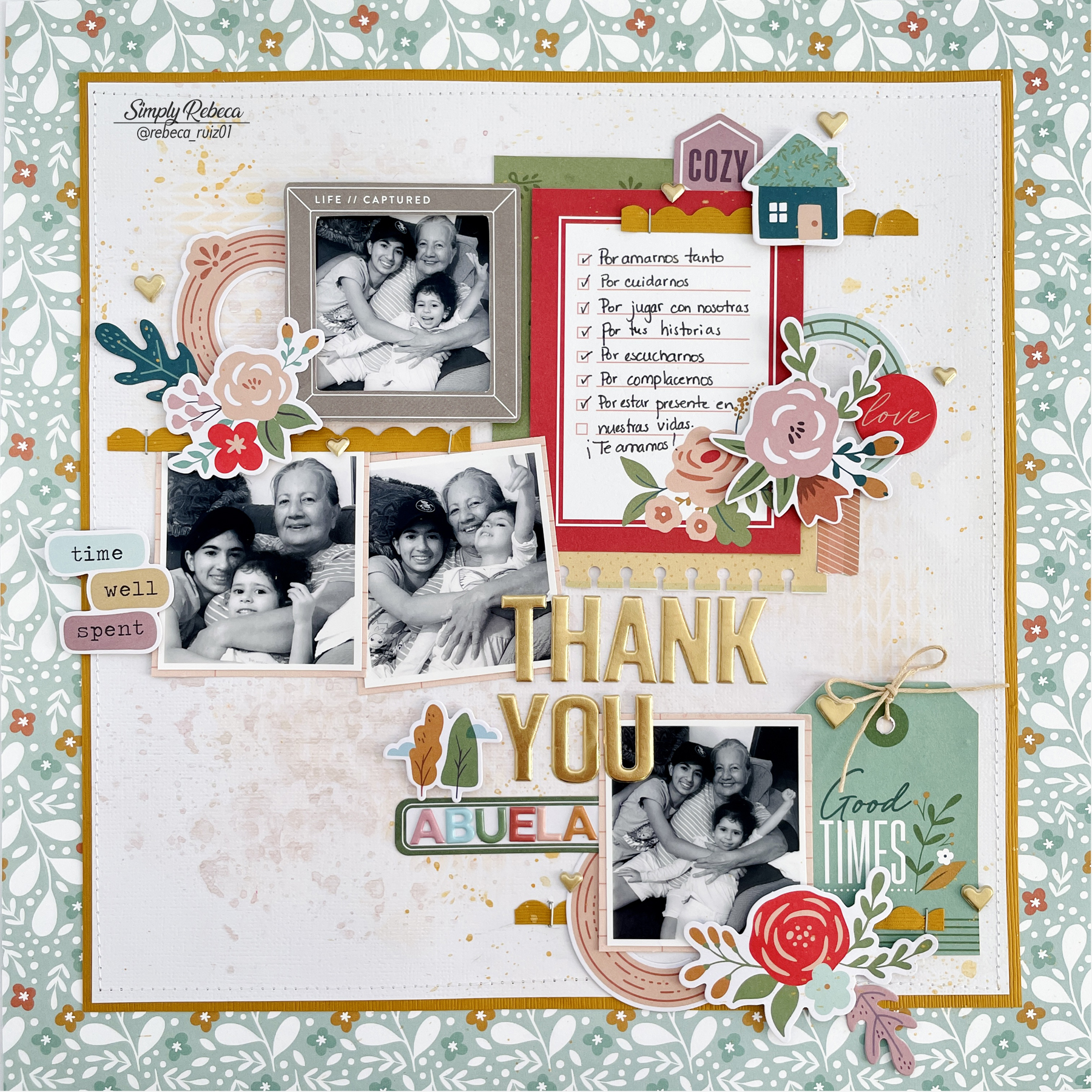

I prepared the white cardstock using clear gesso from Prima Marketing. Then, I added some Shimmerz paints using the packaging technique. I mixed Pink a Boo with a little bit of Thunderstorm to obtain this tone. Then, I used Vicki Boutin art crayons and an Echo Park Paper stencil to add a little detail, very subtle, in the clusters area. After that, I used Shimmerz Old Yeller to add paint splatters to the layout and it matches perfectly with the gold cardstock of the layout.


Once the background was ready, I machine stitched a white border around the layout. I just love to add stitching to my layouts for another texture, dimension, and a pretty look. Now, it's time to work with the photos, title, journaling, and embellishments. Since the photos were very colorful and the tones didn't match with the papers I wanted to use, I decided to print them in black and white. Also, because I want to enhance the bond and love between them, and having the photos in black and white helps me achieve this. Those photos were taken with an old phone and the light was not the best, which means they are not the best quality, but printing them small and in black and white (after playing with the brightness and contrast), helps me to use them to record this special relationship.

I matted the photos in white cardstock and a pink paper from the collection and chose the top one to be the focus by adding a die cut frame with foam adhesive. Once I positioned the photos, I started adding the embellishments. I used a 3" x 4" card from the papers for the journaling and matted it with another green 3" x 4" card and added a piece of yellow paper with a "washi" design. To make help it stand out, I used a We R Memory Keepers notebook edge punch to create the border on it. Then, I used the scraps of the gold cardstock to create three scalloped borders using a Fiskars punch and added them in the clusters area using Tim Holtz tiny stapler.


The other embellishments used are die cuts, stickers, and the chipboard flair. I cut the pink circle in half to use it twice in the layout. To enhance the tag, I used a piece of braiding cord I bought at Walmart some time ago and added a few gold puffy hearts from one of Jen Hadfield collection. Some of those embellishments were added with foam adhesive to add dimension to the layout, like the flowers, the words, and the house.


For the title, I used an American Crafts gold Thickers pack and the tiny alphas from the collection. As you can see, this layout is a busy one, but I love how it turned out and being able to record these special moments that are so valuable.

I hope you like this page and it inspires you to craft and record some memories. Thanks for your visit and for staying with me during this long post! Have a wonderful day!


No comments