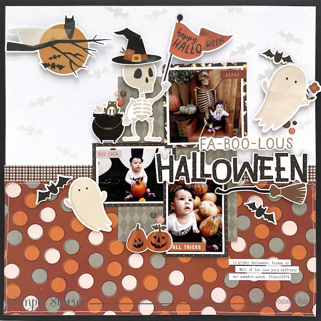
Hello crafty friends! Halloween is around the corner and today I'm sharing a second layout I designed with the FaBOOlous collection by Simple Stories. As mentioned in a previous post, this time I'm using photos of a friend's granddaughter, she provided me with photos of two different occasions and they are so cute that I couldn't choose between them and made two layouts. Now, let's talk about how I made this page.
After having my photos printed in different sizes, I played with them until I found and arrangement I liked. Then, I started working with the background. I used a white cardstock, the bat stencil from the collection and Distress Oxide Lost Shadow to make a subtle background where the bats can be seen without overpowering the layout. I reduced the white cardstock to 11 1/2" x 11 1/2" and glued it to a black cardstock.
Now is time for the fun part, the embellishments and this collection have so many items that it is hard to choose only a few of them. They are all so cute, I couldn't stop adding them to the layout. On the top area I added a die cut with the moon to compliment the background. Then, on the left side of the top photo I added the skeleton since there is one in the photo. To enhance him, I added a witch hat to his head and a cauldron on the side.


No comments