Hello!
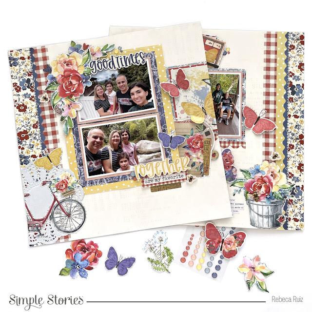
A few days ago, I was using the Simple Vintage Linen Market collection by Simple Stories to create a layout and it is so gorgeous that I continued working with it and made this double layout I'm sharing with you today. Lately they are designing papers that work perfectly for double layouts since one has a design on the left and the other on the right, making our creative process easier. While doing these pages, I recorded the process video, so if you want to see me in action, check it out at the end of this post.
This is the left side layout, where I added the biggest photos, the title, and more embellishments.
This is the right-side layout, where I added a few more embellishments, the smallest photos and the journaling.
Now let's take a closer look at the layouts and the design. After choosing the photos, I matted them with a blush paper from the Basics kit, then added two more papers on the back. The blue is from the 6x8 paper pad and the yellow is from the 12x12 kit. Once I layered them together, I took them to the sewing machine and stitched a border around the blue and yellow paper.
With a precision knife I cut around the doily on the paper to be able to fit the papers behind it, without covering the design. After that, I started embellishing this side of the layout using the floral bits to create a cluster in the corner of the upper photo. There, I also added two chipboard hearts and a foam sticker bee.
For the title I used the foam stickers from the collection and split it between the photos. To anchor the "Together" word, I added an ephemera die cut to give the impression of a cluster, but it is only one piece. Isn't it fantastic, to have this look without spending time adding the layers? After that, I added a 4x4 card matted in a piece of the red polka dot paper and used a precision knife to cut around the yellow butterfly bottom wing to lift it. Then, I added a two more butterflies to the layout, to balance it. In the title area I added a phrase from the sentiments die cuts and a piece of "numbered washi" from the sticker book. The bee is from the foam stickers.
Now, let's take a look at the right-side layout. On this page, I used a patterned paper behind the photos and a part of it is on the left side layout. By doing this, I give the pages continuity. Before adding the blue paper, I stitched a white border using the sewing machine.
Under the blue paper, I added the scalloped sticker from the sticker sheet and finished the layout by adding two butterflies from the floral bits die cuts, a bee from the foam stickers and a ladybug from the floral bits.
To balance this page, I made a cluster on top of the photos. For that, I used die cuts from the layered bits and ephemera packs. With scissors, I cut around the yellow butterfly to place it on top of "the best" card.
The final touches for these pages were the decorative brads and enamel dots.
If you want to watch me creating these layouts, check the process video here:
I had so much fun creating these pages and I love how they turned out. I hope you like them too and they inspired you to craft! Thank you so much for your visit and come back soon for more inspiration.


No comments